Summary: My initial UX design project with CareerFoundry involved creating a vocabulary app. The goal was to research and design a platform that taught new concepts, techniques, and terms.
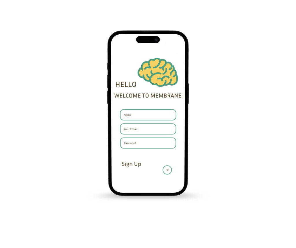
Membrane is a mobile vocabulary-learning app designed to help students quickly create and review digital flashcards. Built for simplicity and focus, it supports learners—especially those less tech-savvy—in building consistent study habits through an intuitive interface
Membrane is designed for college and ESL students who find traditional study apps overwhelming. Many users struggle with busy layouts or complicated navigation—this app keeps things simple and accessible for all experience levels.
Users can study on the go—whether commuting, between classes, or during short breaks. Membrane was designed for iPhone users who need quick, distraction-free access to vocabulary practice wherever they are.
Key features include: • A progress tracker to monitor learning over time • Audio playback for pronunciation support • Import/export tools to streamline flashcard creation
Primary Persona
Name: Rebecca Bloomingdale
Age: 24
Occupation: Full-time student and part-time dental assistant
Location: NYC
“I must perform well in all my classes and prepare for my national board exam. Unfortunately, I have limited time because of my part-time job.”
Goals:
Pass the board exam
Study efficiently in short bursts
Track learning progress easily
Frustrations:
Complex apps waste time
No clear progress tracking
Limited time to explore new tools
Key features
Rebecca wants to study human body parts during her 2-hour commute by listening to her notes.
01
time management
Rebecca has a hard time finding the time to study with her part-time job.
02
study method
Rebecca has hard time identifying the anatomy of the human body.
03
tech
Rebecca is not tech-savvy.
Competitor Analysis
Pro:
The app is easy to use for beginners (it has easy layouts)
It also has diverse ways of learning (speaking, matching, writing)
It gives guidebooks for each unit that summarizes what you will be learning
You can learn different languages at the same time
Con:
The app needs more variety of level
There weren’t that many language options for other native speakers
The point system did not have a significant rewards
The icon displays are confusing
Pro:
It allows users to make their own flashcards
You can also share other people’s study guides
It gives flashcards and Test sections available
You can add pictures on your flashcards
It allows users to lock their flashcards
Con:
Ads
Must download the app to use (no online version)
The design of the app is dull and boring
Prototypes
Usability Test Plan
Participants were given few tasks to see if Membrane app is user friendly.
Participants should be able to create an account
Participants should be able to create a folder
Participants should be able to create an index card
Participants should be able to add pictures on the index card
Usability Test Report
0%
Users did not think it was important to make a folder.
1/
People had difficulty locating the symbol to include additional words.
0
Users did not have trouble signing up.
0%
Users said it was easy and simple to use and they would use it.
Overall
Some users need more time to understand how to navigate study apps, especially if they’re not tech-savvy. Designing Membrane helped me realize how important it is to create a simple, intuitive experience that allows users to focus on learning—not figuring out how to use the app.
Looking ahead, I’d like to improve folder organization and explore features like gamification to make studying more engaging and rewarding. My goal is to continue refining the user experience so that it stays both enjoyable and effortless.